Start With Vision, Not the Checkout Button
If you jump into furnishing or decorating your space without a plan, you’re almost guaranteed to waste money and end up with a room that doesn’t feel quite right. It’s tempting to buy that couch or lamp the second you see it online, but impulse buys rarely align with long-term style or function. Hold off.
First, figure out what you actually like. Is your look minimal and modern? Playful and eclectic? Earthy boho? Or something else entirely? Take time to define your style instead of chasing the latest trend or copying that random influencer’s setup. Once you’ve got a rough idea, start organizing your inspirations. Free platforms like Pinterest and Canva are great for building a mood board. Drop in colors, furniture you like, textures, and even lighting ideas. This helps give your ideas structure.
Most importantly, think about how you actually live. Do you host often? Need floor space for a dog or kids? Hate clutter? Your home should serve your day-to-day life, not just look good in a photo. Good design starts with how you move through and use a space, not how it’s styled for strangers on the internet.
Want a space that feels right? Start with the basics. Measure everything. Walls, windows, door swings, outlets—get it all down. You can’t plan smart if you don’t know your canvas. Once you’ve got the numbers, use a layout app. There are tons of free ones out there that’ll let you drag furniture around without actually lifting it. No guesswork, no bruised shins.
Next, figure out your room’s natural focal points. That might be a fireplace, a big window, or even just the spot with the best light. Build around it, don’t fight it. Speaking of light, it’s a big deal. Morning sun slaps different than afternoon glow. Artificial light changes how colors look. Before you commit to a layout—or a paint color—spend time in the space at different times of day. Your future self will thank you.
Use What You Already Have — Smarter
You don’t need a massive budget or a daily Amazon haul to stand out on camera. The smartest vloggers in 2024 are learning to use their existing wardrobe in sharper, more intentional ways. Instead of chasing every trend, they’re curating their look with pieces that say something. It’s part practicality, part identity.
Mixing styles is where the magic happens. Think: structured blazers with vintage tees, cargo pants with sleek sneakers, or modern cuts layered over thrifted hoodies. That contrast? It adds texture and polish without trying too hard. The goal isn’t to look expensive. It’s to look considered.
If you’re stuck, go vintage. A beat-up leather jacket. A graphic tee from a forgotten band. Classic denim that fits right. Some of the best finds come from thrift stores or local markets if you’re willing to dig. Focus on details—stitching, fabric weight, color fades. These tell stories on camera.
Your audience can tell when you put some thought in—even if it didn’t cost much. That’s the sweet spot: personal over perfect, intentional over trendy.
Creating a strong on-camera presence isn’t just about lighting and gear. The colors and textures around you say a lot—intentionally or not. A messy palette can distract from your message, while a deliberate one helps frame it. Your space doesn’t need to be flashy, but it does need to feel thought-through. Pick 2 to 3 main colors, ideally with one bold and one neutral. That restraint earns you visual credibility.
Color theory isn’t just for art school. Complementary shades (like blue and orange) pop on screen. Analogous tones (like green, blue, and teal) come off calming. Even quick tests with color wheels can steer you away from random choices that confuse the eye.
Materials matter too. Wood adds earthiness, metal brings edge, and stone gives structure. Mixing these can give your frame texture without overcrowding it. Speaking of texture, it’s the difference between a sterile setup and one that feels lived-in. Rough knits, matte finishes, or soft layers add warmth and depth without turning your space into a storage closet. Keep the vibe simple, but make it feel like it’s yours.
Affordable Upgrades That Make a Big Impact
Stunning design doesn’t have to break the bank. Subtle, cost-effective changes can dramatically elevate your space, especially when you focus on high-visual-impact updates. Here are three easy ways to refresh your home without a full renovation.
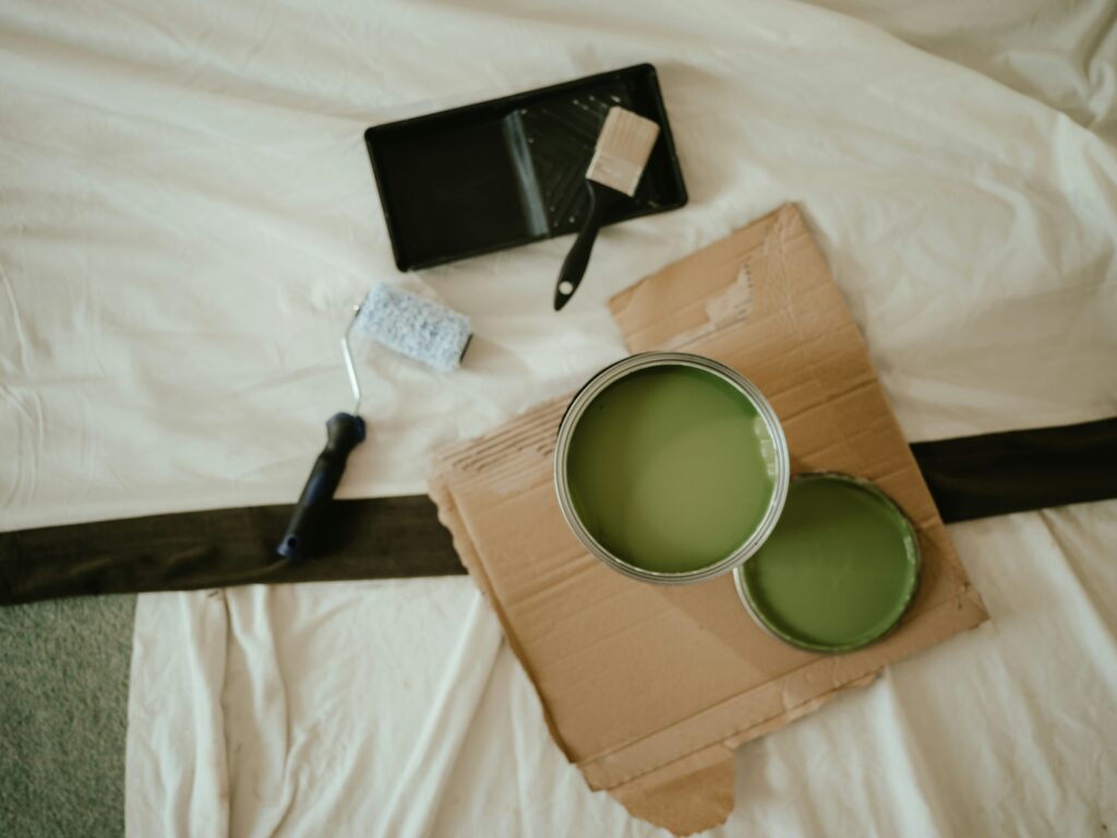
Feature Walls Without the Price Tag
A feature wall adds personality and style to any room, and you don’t need a professional to make it happen.
- Use peel-and-stick wallpaper for bold patterns or textures
- Paint a single wall in a dramatic shade to create contrast
- Try DIY wall panelling with MDF strips for a custom look
These methods allow you to experiment with style while keeping expenses low and effort manageable.
Switch Up Your Hardware
One of the quickest and most affordable transformations you can make involves updating cabinet and drawer hardware.
- Replace old knobs and pulls with modern alternatives
- Try matte black, brushed brass, or ceramic for a fresh look
- Mix and match shapes for a relaxed, eclectic feel
This small swap can breathe new life into existing furniture and refresh the entire room’s aesthetic.
Statement Lighting on a Budget
Lighting defines the tone of a space, and updated light fixtures can become beautiful focal points—even on a shoestring budget.
- Browse secondhand or clearance section for standout finds
- Use plug-in pendant lights to avoid rewiring costs
- Look for sculptural or vintage-style fixtures that add character
Think of lighting not just as functional, but as decorative art with purpose.
Bonus Resource
Looking for more wallet-friendly decorating ideas? Check out this helpful guide: 10 Budget-Friendly Tips for Refreshing Your Living Room
When it comes to designing a space, function isn’t just important—it’s the foundation. Traffic flow matters. If people can’t move through a room easily, it doesn’t matter how stylish it looks. This means placing furniture with real use in mind: where people will talk, sit, walk, and just exist. Arranging conversation zones—like pairs of chairs angled toward each other or a couch facing a coffee table—is one way to make a space feel natural, not staged.
Another key principle: not everything needs to hug the wall. In fact, most things shouldn’t. Floating furniture creates visual breathing room. That armchair in the middle of an open-plan space? It might be the piece that anchors the whole room. It also gives you more flexibility when you want to reconfigure things later.
Room-zoning is the secret sauce of open-plan living. You don’t always need walls—just cues. Use rugs, lighting, and furniture shapes to define areas for working, lounging, or dining. When each space sets its own tone, the whole room feels more deliberate. Less chaotic. More lived-in. And that’s the point.
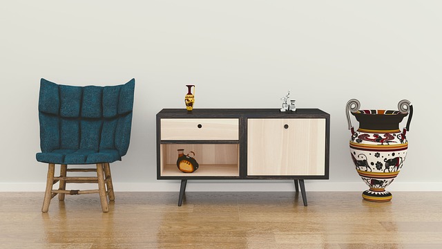
Open shelves aren’t just spaces to fill. They’re a chance to make a space feel lived-in and personal. Forget matching sets or trendy color palettes. The most compelling shelves tell a story — your story.
Start with what you love. That odd ceramic bowl from a street market in Lisbon, a photo from your childhood, a couple of paperbacks you actually read. These are the pieces that spark memory and mood. Mixed textures and shapes make shelves more interesting, and items with meaning give your space soul.
Balance isn’t about symmetry. It’s about spacing, contrast, and rhythm. Place taller objects next to shorter ones. Stack books to stage smaller accents. Leave breathing room between clusters so the eye can rest — and focus. Rotate things out over time to keep it fresh without overthinking.
The goal isn’t perfection. It’s building a visual version of who you are and where you’ve been. Let your shelves show that.
Styling a home that feels intentional but lived-in is easier than it looks. There are a few simple tricks designers swear by, and they all come down to small decisions adding up to a cohesive space.
First up, the rule of 3. Whether you’re arranging decor on a shelf, stacking pillows, or placing objects on a coffee table, odd numbers—especially threes—just work better. Odd groupings feel natural and draw the eye without being too perfect. Go for variation in height, texture, or tone within that trio to give it even more polish.
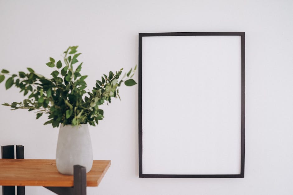
When it comes to art, size matters. Large-scale pieces ground a room and make it feel intentional. Best for wide walls or rooms that need a focal point. Gallery walls are better for storytelling—use them in hallways, over desks, or on smaller walls where you can cluster pieces without overwhelming the room. Mixing frames and formats gives a collected look, but keep some structure so it doesn’t spiral into chaos.
Houseplants: yes, they look good, but not if they’re turning brown after five days. Stick to sturdy options like snake plants, pothos, or ZZ plants. They do fine with low light and occasional neglect. Get a few statement pots and you can rotate them around different rooms for an instant refresh.
Last piece? Scent. It’s the invisible layer that pulls your space together. Use candles, diffusers, or even stovetop simmer pots for a natural feel. Pick one vibe per zone—fresh and herbal near the entryway, warm and woody for the living room. Nothing overpowering, just enough to make the space feel like it has a personality.
Style online works the same way it does in real life — it’s not about throwing money at gear or production. It’s about intention. Smart creators know when to invest in a cleaner camera angle and when to stick with their phone. A well-lit room and solid framing often beat a $2,000 lens with nothing to say.
And don’t rush it. Great style builds over time. You’ll layer choices — music, color palette, editing pace — until it becomes part of your identity. Audiences respond to that consistency.
Follow your gut, but understand the basic rules first. Composition, pacing, audio levels — get those nailed before you start bending the edges. It’s like jazz: you earn the right to improvise by learning the structure. Solid design isn’t accidental. It just feels that way when it’s done right.
 Ask Melodiette Brooks how they got into creative inspirations and you'll probably get a longer answer than you expected. The short version: Melodiette started doing it, got genuinely hooked, and at some point realized they had accumulated enough hard-won knowledge that it would be a waste not to share it. So they started writing.
What makes Melodiette worth reading is that they skips the obvious stuff. Nobody needs another surface-level take on Creative Inspirations, DIY Home Projects, Interior Decorating Tips. What readers actually want is the nuance — the part that only becomes clear after you've made a few mistakes and figured out why. That's the territory Melodiette operates in. The writing is direct, occasionally blunt, and always built around what's actually true rather than what sounds good in an article. They has little patience for filler, which means they's pieces tend to be denser with real information than the average post on the same subject.
Melodiette doesn't write to impress anyone. They writes because they has things to say that they genuinely thinks people should hear. That motivation — basic as it sounds — produces something noticeably different from content written for clicks or word count. Readers pick up on it. The comments on Melodiette's work tend to reflect that.
Ask Melodiette Brooks how they got into creative inspirations and you'll probably get a longer answer than you expected. The short version: Melodiette started doing it, got genuinely hooked, and at some point realized they had accumulated enough hard-won knowledge that it would be a waste not to share it. So they started writing.
What makes Melodiette worth reading is that they skips the obvious stuff. Nobody needs another surface-level take on Creative Inspirations, DIY Home Projects, Interior Decorating Tips. What readers actually want is the nuance — the part that only becomes clear after you've made a few mistakes and figured out why. That's the territory Melodiette operates in. The writing is direct, occasionally blunt, and always built around what's actually true rather than what sounds good in an article. They has little patience for filler, which means they's pieces tend to be denser with real information than the average post on the same subject.
Melodiette doesn't write to impress anyone. They writes because they has things to say that they genuinely thinks people should hear. That motivation — basic as it sounds — produces something noticeably different from content written for clicks or word count. Readers pick up on it. The comments on Melodiette's work tend to reflect that.