Color isn’t just aesthetic anymore. It’s emotional, environmental, and personal. In 2024, the colors we choose are influenced just as much by light and space as they are by taste. Harsh artificial light can dampen even the best tones, while warm daylight softens bold choices. Spaces matter too—what works in a tiny urban studio won’t always translate in an open-plan home.
Mood feeds into all of this. After a few unpredictable years, people are gravitating toward colors that feel grounding: muted earth tones, soft blues, and warm neutrals. Cultural shifts are pushing things further. Sustainability is big, so palettes that mirror nature are doing well. At the same time, digital burnout has made people crave calm and simplicity.
Instead of chasing whatever’s trending, more folks are building palettes that adjust to the way they live. Think softer seasonal shifts, layered neutrals, and accent tones that reflect individual rhythm. Adaptability is the new rule. Color isn’t about keeping up—it’s about tuning in.
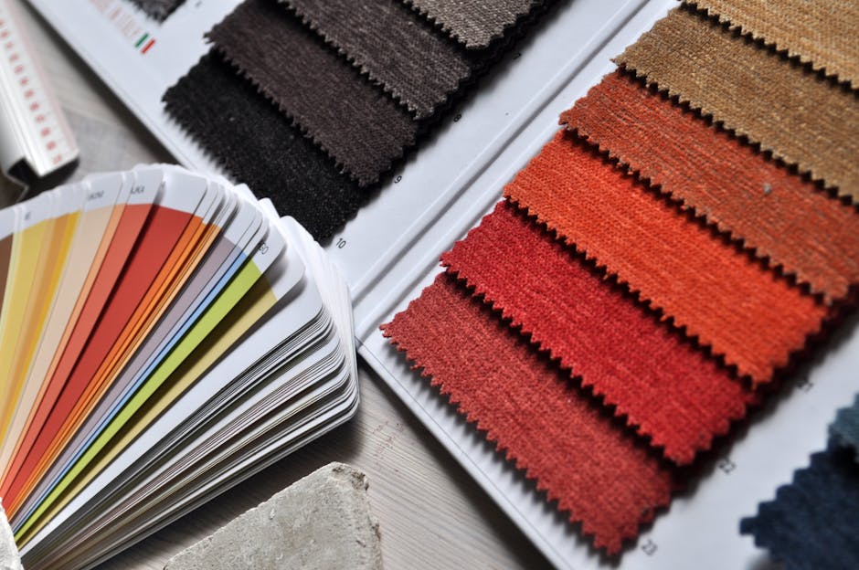
Warm Neutrals Over Cool Grays
Cool grays had their moment, but 2024 is all about warmth. Taupe, sand, and mushroom tones are taking over, bringing softer energy into homes. Unlike icy grays that can feel flat or sterile, these warm neutrals play well with natural textures like wood, stone, or linen, and they feel more grounded in open spaces.
They also adapt well to the way people live now. Open-concept living areas gain subtle contrast without looking busy. In bedrooms, these tones make for a more comforting, sleep-ready atmosphere.
Think of them as neutral with a pulse. You’re not sacrificing minimalism—you’re just giving it more depth.
Lighting isn’t just about brightness anymore. Vloggers are getting smarter about how their environments look on camera, and adaptive lighting is stepping in to help. These systems subtly shift color and intensity throughout the day, mimicking natural light changes. That means better skin tones on video and a workspace that doesn’t fry your eyes during late-night editing sessions.
Color palettes are no longer random. Creators are choosing tones to boost focus, reflect mood, and reduce strain during screen-heavy days. Warmer shades in the evening, cooler tones in the morning, all designed to work with the body’s rhythm and keep energy steady.
What’s happening behind the scenes—light levels, saturation shifts, diffusion—is just as crucial as what happens in front of the camera. It’s not just aesthetics. It’s function.
For more on how smart tech is reshaping creative spaces, check out Smart Home Innovations Influencing Interior Design.
Creating Cohesive Color Flow in Open Spaces
Designing an open floor plan calls for more than just picking a few stylish paint swatches. The key to success lies in working with natural light, reading the room’s architecture, and planning color transitions intentionally. Here’s how to approach your color plan with clarity and confidence.
Make Natural Light Your Guide
Natural light can dramatically influence how a paint color appears throughout the day. Understanding the direction and intensity of daylight in your space helps you select shades that remain consistent and pleasing.
- Observe how light enters throughout the day in different zones
- North-facing rooms often need warmer tones to offset cooler light
- South-facing spaces can take bolder or cooler colors due to their brightness
- Use light to define spaces without physical walls
Use Architecture to Frame Color Changes
In open-concept spaces, structural elements can help create natural transitions between colors.
- Frame changes at corners, ceiling shifts, or built-ins like fireplaces and shelving
- Use trim, accent walls, or wainscoting to create subtle division between areas
- Consider sightlines: colors should shift comfortably from one space to the next
Plan Transitional Colors for Visual Harmony
A strong color palette flows effortlessly from one area to another without feeling disjointed or repetitive.
- Choose a base neutral to act as an anchor
- Layer with two or three accent colors that complement each other
- Think in families: warm vs. cool palettes make transitions gentler
- Keep undertones consistent to avoid visual clashes
Test Before You Commit
Before applying paint across walls, take the time to experiment with samples. Testing in real-time conditions prevents color regret.
- Paint swatches on multiple walls to see how light impacts the tone
- Observe at different times of day and under varying lighting
- Compare against furniture, flooring, and fixtures for a cohesive look
- Live with samples for a few days to get a true feel for the space
Proper planning and testing lead to color choices that feel intentional and connected. A thoughtful approach ensures your open floor plan looks seamless and feels inviting from every angle.
Bold color splashes are taking a back seat. In 2024, we’re seeing vlogs lean into layered, tone-on-tone palettes that feel more grounded and intentional. Think muted olives layered over sage, or creams playing off beiges. It’s less about loud contrast, more about visual cohesion.
Accent colors haven’t disappeared, but they’re not running the show. Instead of screaming for attention, they’re placed with rhythm. A bright cuff. A neon notebook in the background. These small hits guide the eye instead of hijacking it.
Material finish is also playing a bigger role. Matte surfaces keep things modern and clean. Velvet gives softness. Brushed metallics add subtle edge. These textures bring character without needing heavy visual noise. It’s smart styling for a viewer who’s grown out of chaos.
Trendy colors come and go. What actually sticks is what feels right for your space and your life. If you’re always hosting friends, maybe you want warm tones that invite people in. If your home is your quiet place, cooler, muted shades probably make more sense. The point is, stop chasing color palettes that look good on someone else’s feed. Start with how you live, then layer in what you love.
That doesn’t mean trends are useless. They’re good for discovering new ideas, fresh takes, or palettes you hadn’t considered. But they’re not rules. Pick and choose what fits. If everyone’s going for bold greens or terracotta walls, but that clashes with your vibe, skip it. There’s no award for trend compliance.
One rule stands: it has to feel like home. Not like a showroom. Not like a Pinterest board. Just yours. That’s the color test worth trusting.
 Ask Melodiette Brooks how they got into creative inspirations and you'll probably get a longer answer than you expected. The short version: Melodiette started doing it, got genuinely hooked, and at some point realized they had accumulated enough hard-won knowledge that it would be a waste not to share it. So they started writing.
What makes Melodiette worth reading is that they skips the obvious stuff. Nobody needs another surface-level take on Creative Inspirations, DIY Home Projects, Interior Decorating Tips. What readers actually want is the nuance — the part that only becomes clear after you've made a few mistakes and figured out why. That's the territory Melodiette operates in. The writing is direct, occasionally blunt, and always built around what's actually true rather than what sounds good in an article. They has little patience for filler, which means they's pieces tend to be denser with real information than the average post on the same subject.
Melodiette doesn't write to impress anyone. They writes because they has things to say that they genuinely thinks people should hear. That motivation — basic as it sounds — produces something noticeably different from content written for clicks or word count. Readers pick up on it. The comments on Melodiette's work tend to reflect that.
Ask Melodiette Brooks how they got into creative inspirations and you'll probably get a longer answer than you expected. The short version: Melodiette started doing it, got genuinely hooked, and at some point realized they had accumulated enough hard-won knowledge that it would be a waste not to share it. So they started writing.
What makes Melodiette worth reading is that they skips the obvious stuff. Nobody needs another surface-level take on Creative Inspirations, DIY Home Projects, Interior Decorating Tips. What readers actually want is the nuance — the part that only becomes clear after you've made a few mistakes and figured out why. That's the territory Melodiette operates in. The writing is direct, occasionally blunt, and always built around what's actually true rather than what sounds good in an article. They has little patience for filler, which means they's pieces tend to be denser with real information than the average post on the same subject.
Melodiette doesn't write to impress anyone. They writes because they has things to say that they genuinely thinks people should hear. That motivation — basic as it sounds — produces something noticeably different from content written for clicks or word count. Readers pick up on it. The comments on Melodiette's work tend to reflect that.