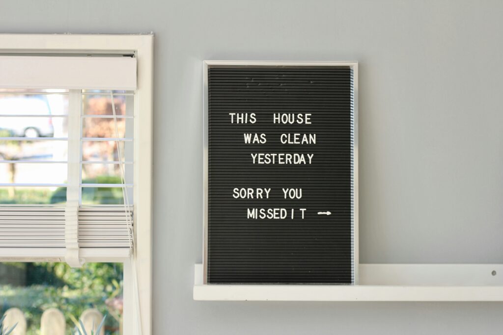
Moving Beyond Vinyl Wall Quotes
The Problem with Overused Vinyl Decals
Vinyl wall quotes once brought charm and personality to spaces, but their effectiveness has started to wear thin. They’ve become a design cliché—expected, generic, and often uninspired.
- Common phrases like “Live, Laugh, Love” or “Home Sweet Home” now feel outdated
- Lack of individuality makes spaces feel less intentional or unique
- Vinyl decals can peel or crack over time, creating maintenance issues
Designers are increasingly steering away from these one-size-fits-all solutions in favor of more expressive, custom-focused ideas.
Why Designers Are Seeking More Dynamic Solutions
Modern interiors demand visual storytelling that feels tailored and immersive. Whether it’s for a residential wall or a commercial backdrop, more designers are moving toward custom graphics, murals, mixed-media displays, and layered installations that speak directly to the identity of the space.
Here’s what today’s design-forward alternatives offer:
- Seamless integration with architecture and lighting
- Use of different materials like wood, metal, or textured paint
- Interactive designs that reflect the story or purpose of the space
From Generic to Signature: Real Design Upgrades
Creative professionals are upgrading generic decals into memorable experiences. Here are a few standout case studies:
- Boutique Coffee Shop: Swapped quote decals for hand-painted typography over exposed brick to match the brand’s artisanal image
- Startup Office: Replaced vinyl with a laser-cut acrylic mission statement wall that doubles as a photo backdrop
- Modern Home Entryway: Turned a typical greeting quote into a minimalist wood-panel inlay with LED backlighting for warmth
The message is clear: good design doesn’t come in pre-cut phrases. Customization tells a story worth seeing—and remembering.
Tactile Typography: Adding Depth Through Materials
Design is moving beyond ink and screen—typography is becoming a three-dimensional experience. From architectural signage to interior décor, text is now being embedded, engraved, and stitched into physical environments for added dimension and visual interest.
Laser-Cut Lettering for Dimensional Impact
Cutting-edge design often starts with cutting-edge tools. Laser-cut lettering allows for crisp, clean edges and a professional finish. It’s particularly effective for signage, feature walls, and branding displays.
- Materials commonly used:
- Metal (aluminum, stainless steel, brass)
- Wood (birch, walnut, MDF)
- Acrylic and plexiglass
- Ideal applications:
- Business signage and office branding
- Custom home décor and gallery walls
Etched in Stone: Typography in Surfaces
Engraving and inlay work bring a permanent, tactile quality to text. Used correctly, type etched into stone or tile can feel both modern and timeless.
- Common uses:
- Kitchen countertops with embedded quotes or names
- Stone tiles engraved with identifiers or design statements
- Memorials or architectural plaques
- Materials:
- Granite, quartz, marble, ceramic
Soft Surfaces, Strong Statements: Fabric Typography
Typography doesn’t have to be hard-edged to make an impact. Stitching and fabric-based lettering introduce warmth and tactility into spaces like living rooms, theaters, and cafes.
- Techniques:
- Embroidery and appliqué
- Screen-printing on fabric
- Cut-and-sew patches for upholstery
- Popular placements:
- Decorative throw pillows and curtains
- Custom textile wall art
- Branded cushions or merchandise
Blending typographic design with physical materials adds personality, character, and dimensionality in ways print or digital alone can’t match.
Typography in interiors isn’t just about signs pointing to exits or cheeky quotes on coffee mugs anymore. The design world has started treating text as a visual language with real weight. In modern spaces, lettering has moved from functional to emotional—used less to instruct and more to express.
Designers are playing with scale, material, and placement to let letterforms stand on their own—etched into stone, painted across ceilings, stitched into upholstery. These aren’t just messages; they’re design elements that carry character. Well-placed type can draw attention, define a mood, or tell a story without adding clutter.
Text-based design gives interiors a voice. It’s not about being loud. It’s about feeling intentional, personal, and human. In a world full of noise, a single word on a wall can say more than an entire color palette. That’s the power of expressive typography: presence without shouting.
Alphabet is no longer just for books and branding—it’s showing up in the bones of interior design. Think letterforms as structure. Designers are now using typography to shape space itself. Custom shelving shaped like initials. Room dividers inspired by ligatures. These aren’t novelty pieces—they’re functional and personal, often fabricated with CNC precision or 3D-printed infills.
On the floor, type gets even more covert. Mosaics built into entryways or stair risers spell out intentional messages—sometimes only visible from the right angle. It’s part visual pun, part hidden mantra. The letters become texture and design language.
Then there’s furniture: benches with carved slogans, tables etched with quotes, beds where the headboard becomes a monogram. In 2024, it’s not just about form following function. It’s about form following font. And for creators or homeowners who want to inject identity into their environments, typography makes it personal without shouting.
Lighting in vlogs used to be functional. Now it’s part of the storytelling. Creative neon setups are finding their way into more home studios and mobile rigs—not just as background fluff but as mood setters that help define the creator’s vibe. From soft pink glows for late-night confessionals to cold neon blues for tech reviews, vloggers are customizing their lighting to match tone and topic.
Another trend shaping up fast is the use of LED typography panels. Think bold words or short quotes in clean fonts, lit up on walls or shelves. They’re not just decorative—they add character and context. For creators, it’s less about shouting for attention and more about creating a frame that speaks even when they’re silent.
Want more ideas on how creators are blending form and function? Check out this deep dive: Innovative Lighting Designs That Add a Dramatic Touch.
Telling Your Story Through Custom Typography
Typography as a Storytelling Tool
Custom typography can do more than just look beautiful—it can communicate a legacy, a viewpoint, or a deeply personal story. Whether you’re drawing from heritage, culture, or lived experience, letterforms can carry meaning if designed with intention.
Consider how these themes might shape your approach:
- Family lore and storytelling: Use stylistic references to ancestral languages or scripts
- Cultural roots: Draw on traditional motifs from your family’s background
- Unique perspective: Create abstract or hybrid letterforms that reflect your worldview
Avoiding Clichés with Meaningful Design
It’s easy to fall into familiar tropes or overly sentimental motifs when trying to create meaningful type. Instead, focus on originality and authenticity.
Here are some fresh ways to integrate personal meaning:
- Symbolic subtlety: Let patterns or rhythm in the typography reveal deeper messages
- Unexpected influences: Combine modern and traditional scripts for contrast
- Color and texture: Use materials or color palettes that reflect personal significance
Avoid overly literal symbols unless they genuinely add depth. Balance emotion with refinement.
Collaborating with Creative Practitioners
Working with typographers or artisans can elevate a handmade or personal dimension in your piece. But like any creative partnership, alignment is key.
Tips for successful collaboration:
- Communicate your intention clearly: Share your story, references, and key values
- Respect their process: Allow room for their interpretation while guiding with context
- Prototype together: Don’t wait until the final version—test early and revise together
Typography that tells your story takes time and care. Whether personal or cultural, the result should resonate with both you and your audience.
Typography is no longer just a design afterthought — it’s a mood setter. Choosing the right typeface matters more than ever. Serif fonts lend a sense of tradition or editorial weight. Sans-serif keeps things clean, modern, and direct. Then there’s the experimental stuff — handwritten, distorted, or ultra-minimal — perfect when you want your branding to feel unique or disrupt expectations.
Scale also plays a big role. A tiny accent type in a lower corner can whisper authority. Oversized, all-caps headers shout confidence. The question is: what tone are you setting, and how loud do you want it to speak?
Then comes color. Type in muted earth tones feels grounded and serious. Bright reds and oranges suggest energy and urgency. Cool blues calm things down. These are subtle cues, but they influence how your message lands. Smart creators choose typography like they would choose lighting: intentionally.
Typography isn’t just decoration. It’s a tone of voice. A mood. It shapes how a message feels before a single word is read. In home interiors, this becomes even clearer. A simple serif on the wall can soften a space. A bold sans-serif can anchor it with modern weight. More than trend, good typography is emotional architecture.
But the best work doesn’t blindly follow what’s popular. It digs deeper. It turns a phrase into something personal, choosing curves, lines, and spacing that say what can’t be said out loud. That’s where type becomes more than design. It becomes storytelling.
Designers and homeowners alike are leaning into this. Typography is no longer just a feature. It’s part of the fabric. Whether it’s a quote in the hallway or custom letterforms etched into glass or wood, the message and the medium merge. The result isn’t loud. It’s intentional. And that sticks longer than any seasonal trend.
 Ask Geldric Kelthorne how they got into gardening and landscaping ideas and you'll probably get a longer answer than you expected. The short version: Geldric started doing it, got genuinely hooked, and at some point realized they had accumulated enough hard-won knowledge that it would be a waste not to share it. So they started writing.
What makes Geldric worth reading is that they skips the obvious stuff. Nobody needs another surface-level take on Gardening and Landscaping Ideas, Creative Inspirations, DIY Home Projects. What readers actually want is the nuance — the part that only becomes clear after you've made a few mistakes and figured out why. That's the territory Geldric operates in. The writing is direct, occasionally blunt, and always built around what's actually true rather than what sounds good in an article. They has little patience for filler, which means they's pieces tend to be denser with real information than the average post on the same subject.
Geldric doesn't write to impress anyone. They writes because they has things to say that they genuinely thinks people should hear. That motivation — basic as it sounds — produces something noticeably different from content written for clicks or word count. Readers pick up on it. The comments on Geldric's work tend to reflect that.
Ask Geldric Kelthorne how they got into gardening and landscaping ideas and you'll probably get a longer answer than you expected. The short version: Geldric started doing it, got genuinely hooked, and at some point realized they had accumulated enough hard-won knowledge that it would be a waste not to share it. So they started writing.
What makes Geldric worth reading is that they skips the obvious stuff. Nobody needs another surface-level take on Gardening and Landscaping Ideas, Creative Inspirations, DIY Home Projects. What readers actually want is the nuance — the part that only becomes clear after you've made a few mistakes and figured out why. That's the territory Geldric operates in. The writing is direct, occasionally blunt, and always built around what's actually true rather than what sounds good in an article. They has little patience for filler, which means they's pieces tend to be denser with real information than the average post on the same subject.
Geldric doesn't write to impress anyone. They writes because they has things to say that they genuinely thinks people should hear. That motivation — basic as it sounds — produces something noticeably different from content written for clicks or word count. Readers pick up on it. The comments on Geldric's work tend to reflect that.