Color isn’t just about pretty walls anymore. It’s being used as a tool, not a garnish — to shift mood, define space, and send clear messages. Designers and homeowners alike are putting more thought into palettes that make people feel something. These days, a muted blue isn’t just calming. It’s a signal that a space is meant for quiet. A burnt orange isn’t just trendy. It says bold, grounded, alive.
The pandemic forced a rethink of what home feels like. Comfort took priority. Now, that shift is sticking — but evolving. People want spaces that recharge them, support focus, or bring warmth. The palette is playing a central role. Colors are being deployed strategically to carve mental zones in open floor plans — energize a home office, soften a noisy living room, give a bedroom that sleep-first tone.
From earthy neutrals to moody contrasts, the trend for 2024 is about color with purpose. It’s not just what looks good. It’s what feels right and functions well. The walls are talking. People are finally listening.
Warm taupes, soft browns, and grounded grays are leading a quiet revolution in visual storytelling. These are not just color choices, they’re mood setters. Where harsh white space and clean-black contrast once dominated, vloggers are now leaning into palettes that feel calm, lived-in, and human.
This trend marks a pivot from stark minimalism to something more approachable—cozy minimalism. It’s still clean, still intentional, but far less sterile. These colors photograph well, complement a wide range of skin tones, and create an inviting visual environment that draws viewers in without overwhelming them.
Beyond aesthetics, warm neutrals have a subtle power. They influence emotional perception, giving spaces a softer edge and encouraging viewers to feel comfortable and grounded. For vloggers, that level of subconscious connection is valuable. It makes content feel more authentic, less manufactured. It helps build trust. Less flash. More feel.
In a content landscape where tone and texture matter more than ever, these shades bring something viewers can quietly connect with. And that’s the point.
Color in vlogging spaces is getting bolder, with deep greens, terracotta reds, and navy blues making a strong return. These tones aren’t just trending—they’re grounding, dramatic, and full of personality. They show up best where they can frame the shot without stealing it.
Strategic placement is the trick. Think accent walls behind the lens, matte-finish cabinetry in the kitchen vlog zone, or a navy velvet chair as the pop in your sit-down setup. Creators are using these shades to build visual identity without going overboard.
The key is balance. Color zoning helps—grouping visuals in a way that guides the eye without overwhelming it. One bold wall, neutral floors, touches of color in props. Clean lines, even if the hues shout. It’s not just design for design’s sake. It’s about flow that supports content, not distracts from it.
Biophilic design isn’t new, but in 2024, vloggers are leaning hard into palettes pulled straight from nature. Think muted greens, weathered stone tones, and soft sand-inspired neutrals. These shades do more than look good on camera. They create an atmosphere that feels calm, grounded, and real.
There’s hard science behind it, too. Studies continue to show that natural colors help reduce stress, lower visual fatigue, and improve focus—something both creators and viewers can appreciate. Just swapping out harsh lighting for warm earth tones can reshape the entire energy of a recording space.
When combined with organic textures like raw wood, soft linen, or unfinished concrete, this palette becomes immersive. It’s not just decoration. It feels lived-in. And for audiences hungry for authenticity, that’s powerful. Vlog setups that blend visual calm with tactile warmth cue a kind of quiet intimacy—one that invites viewers to linger and connect.
Vlogging doesn’t happen in a vacuum. Design trends coming out of fashion runways, tech interfaces, and global expos are filtering into how vloggers present their content. Whether it’s the texture of a thumbnail background, the grain on a graphic overlay, or the lighting in a room tour, what’s trending in the design world ends up on screen—fast.
Right now, color psychology is driving strong visual choices. Soft pastels paired with deep neutrals are popping up everywhere, driven by a shift toward calm confidence in uncertain times. Blue tones signal reliability. Earthy greens invoke stability. Bright punches like orange or magenta are used strategically to grab attention without overwhelming viewers.
Seasonal forecasting, once reserved for retail and interior designers, is now a real factor in successful content planning. Creators who align their visual language with broader seasonal moods come off polished and intentional. Whether it’s matching a spring aesthetic in April or pulling in saturated tones for fall, keeping a pulse on where design is going can help vloggers stay visually relevant without needing to reinvent their brand every quarter.
Smart Paint and Digital Design Tools Shape the Future of Home Aesthetics
As technology continues to influence the design world, it’s now making its mark in unexpected places—like the paint on your walls and the way you preview those colors. In 2024, smart materials and digital tools are helping homeowners and designers make more informed, more eco-conscious, and more personalized decisions.
Smart Paints with Purpose
Paint is no longer just about adding color—it’s about adding function. New formulations are engineered to support healthier, more efficient living spaces.
- Anti-microbial finishes: Ideal for kitchens, bathrooms, and high-touch surfaces, these paints help reduce bacteria and improve hygiene.
- Light-reflective coatings: Designed to maximize natural daylight, these paints can make smaller spaces feel larger and reduce reliance on artificial lighting.
- Eco-friendly options: Low-VOC and biodegradable formulas are becoming must-haves in sustainable interior design.
These innovative finishes allow homeowners to choose paint not just for shade, but for how it supports their lifestyle and values.
Try Before You Apply: Digital Visualization Tools
Visualizing color in a space has always been a challenge, especially when lighting and furniture affect perception. Now, digital design tools are bridging that gap with intuitive, real-time visualization apps.
- Upload a photo or use augmented reality to test paint schemes
- Experiment with accent walls, trim colors, and finish types
- Adjust lighting scenarios to see how color appears at different times of day
These tools empower users—both DIYers and professionals—to make confident color choices before ever opening a paint can.
Curious about more ways technology is influencing design? Explore the broader topic in Smart Technology and Its Impact on Home Design Evolution.
Color is having a moment, but not just for aesthetics. Interior designers are pulling trending palettes into projects to say something about the people who live in the space. Think earthy greens in homes of grounded, outdoorsy types or moody blues in a room meant for deep focus. Instead of picking colors just because they’re popular, designers are asking what the shades say about personality, pace of life, and emotion.
For homeowners looking to refresh their space without spending big, color is one of the easiest and cheapest levers to pull. Repainting a room, swapping out throw pillows, or adding curtains in a bold hue can reset the entire tone. Focus on strategic zones like entryways or kitchen walls where even a small color change makes a big visual impact.
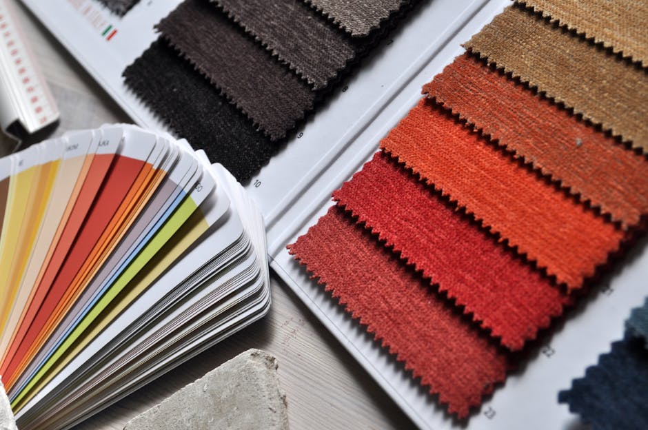
Not ready to commit? Don’t. Test out a few shades on the wall or live with color swatches for a week. Take photos in morning and evening light. Let your gut do the deciding. Trends come and go, but how a color makes you feel in your own space is what actually matters.
Color is getting smarter. For 2024, muted futuristic tones are leading the way—think dusty silvers, digital lavender, and soft, nostalgic pastels pulled from 90s tech and childhood nostalgia. These shades aren’t loud, but they’re not forgettable either. They’re the new backdrop for vlogs that feel modern without trying too hard.
We’re also seeing a hunger for flexibility. Creators want surroundings that sync with their mood, brand, or narrative. That’s why customizable elements like color-changing LED panels, dynamic set filters, and background-responsive visuals are popping up. It’s all about creating a vibe that shifts with the story—without swapping out your entire setup.
But here’s the kicker: following color predictions step-for-step isn’t the move. The vloggers staying powerfully relevant aren’t trend-obsessed—they’re design-aware. They pick palettes that feel personal and consistent with their story, not just what’s hot. That’s how you build a visual identity with some staying power.
Color isn’t just about pretty walls or matching throw pillows. Used well, it’s a workhorse. Whether it’s a bold red in a workspace or muted earth tones in a living room, intentional color choices can shape how we feel and function day to day. It’s about more than aesthetics. Color can energize, calm, signal space, or simply make a place feel like home.
The smarter approach now is to use color with both feeling and logic. Not trends. Not guesswork. Think about how people actually move through a space, what mood that room should support, and how color can reinforce that.
Bottom line: modern interiors thrive when every shade pulls its weight. Form meets function, and color does more than decorate—it works.
 Ask Melodiette Brooks how they got into creative inspirations and you'll probably get a longer answer than you expected. The short version: Melodiette started doing it, got genuinely hooked, and at some point realized they had accumulated enough hard-won knowledge that it would be a waste not to share it. So they started writing.
What makes Melodiette worth reading is that they skips the obvious stuff. Nobody needs another surface-level take on Creative Inspirations, DIY Home Projects, Interior Decorating Tips. What readers actually want is the nuance — the part that only becomes clear after you've made a few mistakes and figured out why. That's the territory Melodiette operates in. The writing is direct, occasionally blunt, and always built around what's actually true rather than what sounds good in an article. They has little patience for filler, which means they's pieces tend to be denser with real information than the average post on the same subject.
Melodiette doesn't write to impress anyone. They writes because they has things to say that they genuinely thinks people should hear. That motivation — basic as it sounds — produces something noticeably different from content written for clicks or word count. Readers pick up on it. The comments on Melodiette's work tend to reflect that.
Ask Melodiette Brooks how they got into creative inspirations and you'll probably get a longer answer than you expected. The short version: Melodiette started doing it, got genuinely hooked, and at some point realized they had accumulated enough hard-won knowledge that it would be a waste not to share it. So they started writing.
What makes Melodiette worth reading is that they skips the obvious stuff. Nobody needs another surface-level take on Creative Inspirations, DIY Home Projects, Interior Decorating Tips. What readers actually want is the nuance — the part that only becomes clear after you've made a few mistakes and figured out why. That's the territory Melodiette operates in. The writing is direct, occasionally blunt, and always built around what's actually true rather than what sounds good in an article. They has little patience for filler, which means they's pieces tend to be denser with real information than the average post on the same subject.
Melodiette doesn't write to impress anyone. They writes because they has things to say that they genuinely thinks people should hear. That motivation — basic as it sounds — produces something noticeably different from content written for clicks or word count. Readers pick up on it. The comments on Melodiette's work tend to reflect that.