Walls do more than fill a room. They anchor the energy. Whether it’s a bold paint choice, a mix of art pieces, or even bare concrete left untouched, what you put on your walls—or don’t—sets the emotional temperature every time you walk in.
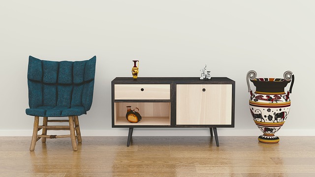
Styled walls can elevate even the most modest space. Think a 300-square-foot studio that feels deliberate because of a strong gallery wall or a statement textile. It’s not about money or size. It’s about intention.
The point isn’t to fill space for the sake of it. It’s to build a visual story. A row of frames tells more than who’s in the photos. A single abstract piece might be a marker of your mood shift last year. That’s the difference. Styled walls talk. Random decor whispers and gets ignored.
When it comes to creating a clean, scroll-stopping vlog background, wall design matters more than people think. The goal isn’t to overwhelm; it’s to support the story. That’s where cohesion, balance, and scale come into play. Every visual element—whether it’s a bold art print or a subtle shelf detail—should feel like it belongs.
Start by curating your artwork and frames. Stick to a consistent color palette and frame style. One loud print can work if it’s grounded by quieter visuals. Mix vertical and horizontal pieces for energy, but don’t go wild. Think of your wall like a playlist—variety with a vibe.
Placement is all about spacing and flow. Layout grids help. Hang larger pieces at eye level. Use the center of your wall as an anchor point, then build out. Keep 2–3 inches between frames unless you’re doing a tight gallery look.
What trips most people up? Cluttering the wall with too much or overthinking it into paralysis. If it feels forced, pull it back. Leave room for future additions. Let the space breathe.
Murals make statements. Big ones. Whether you’re filming from a cozy corner of your apartment or a converted garage studio, the right mural can change how people feel when they watch your content—and how you feel when you create it. Impact comes from contrast. A bold wall layered behind a quiet moment? That sticks.
So where and when do murals matter most? Entry points and backdrops. Your filming wall, the space behind your desk, or even the first thing people see when they walk in. These are zones that set tone. Murals can turn a blank wall into a brand.
DIY works if you’re hands-on or just starting out. You get control and save money, and imperfections can lean charming. But for a cleaner, standout look—especially if you’re building a signature style—you may want to bring in a pro. An artist brings technique, polish, and perspective. They see walls differently.
Abstracts deliver mood. Scenic pieces open up small spaces. Typography keeps things sharp and on-message. Pick what matches your content’s tone. Don’t decorate—communicate.
The real win? Energy. A mural shifts how a room feels. It adds intention. It says, ‘I’m building something here.’ Great content comes from great space. A mural helps build both.
Lighting that Elevates Wall Design
Lighting isn’t just a design afterthought—it’s a crucial element that can elevate or diminish the effect of your wall features. Whether you’re highlighting a bold mural, a textured surface, or a curated art collection, the right lighting can transform a space visually and emotionally.
How Lighting Amplifies Wall Design
Walls tell a story, and lighting brings that story to life. Here’s how it works:
- Creates depth and dimension: Accent lighting adds shadows and highlights, bringing textures and surfaces to life.
- Draws the eye: Light naturally guides attention. Well-placed lighting emphasizes key elements and focal points.
- Enhances color and contrast: Proper lighting can either soften or intensify wall colors, depending on the mood you aim to create.
Spotlighting Artwork or Murals
Art deserves to be seen clearly and intentionally. The goal is to enhance the work without washing it out or casting distracting shadows.
- Use adjustable track or recessed fixtures to direct light exactly where it’s needed
- Position lights at a 30-degree angle to reduce glare and reflections
- Opt for warm or neutral white lighting to maintain color accuracy
- For murals or larger installations, use wall washers or linear LEDs for even coverage
Balancing Ambient and Task Lighting
To support both atmosphere and functionality, it’s important to layer your lighting.
- Ambient lighting: Sets the overall tone of the room. This could include recessed lights or pendants that provide general illumination.
- Task lighting: Intended for specific activities such as reading or working. Desk lamps or sconces serve both form and function here.
- Accent lighting: Highlights design elements like textured walls, architectural features, or art, contributing to layered dimension.
When each type of lighting plays its part, your wall design isn’t just visible—it becomes immersive.
For deeper insights: Lighting Matters: Illuminating Tips to Transform Your Space
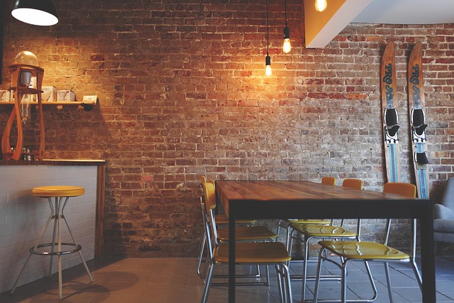
Whether it’s a studio or a corner of your apartment, today’s vlogging spaces are more layered than ever. Creators are leaning into tactile backdrops—think wood slats, exposed brick, hand-troweled plaster, and dramatic paneling. These materials bring mood and depth without screaming for attention. They’re not just design choices—they’re atmosphere.
Function matters, too. Floating shelves do more than store things—they frame your stories. Sculptural hooks give your gear or wardrobe a spotlight. Plant installations? Still huge. They’re low-fi, high-impact, and bring an organic break to video compositions.
Mirrors are working double shifts. A well-placed mirror opens up tight shooting spots and adds visual rhythm. Whether you’re recording on a phone or DSLR, they make small look expansive, and neutral look elevated.
Then comes paint—used less like color, more like composition. Creators are experimenting with color-blocking to guide viewer focus, ombré transitions to add softness, and stencils to build repeatable branding into their frame. None of it’s fancy. But when done right, it makes your space work harder than your camera.
Walls talk, even when you don’t mean them to. The art you hang, the paint you choose, the wear from life lived — it all says something. That’s why styling them isn’t about cluttering every corner or jumping on trends. You don’t need more stuff. You need intention.
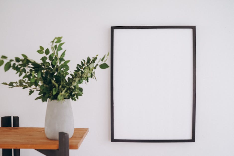
Start with less, but choose boldly. Go for pieces that mean something to you. A single framed sketch can outdo a whole gallery wall of filler. A bare section of wall isn’t empty — it’s potential. Give your space breathing room, and let it evolve.
Your tastes shift, your story grows — your walls should reflect that. They aren’t a final draft. They’re an ongoing project. Keep it simple, stay honest, and don’t be in a rush to finish what’s meant to change.
 Rebecca McDanielords is the kind of writer who genuinely cannot publish something without checking it twice. Maybe three times. They came to diy home projects through years of hands-on work rather than theory, which means the things they writes about — DIY Home Projects, Gardening and Landscaping Ideas, Home Design Trends, among other areas — are things they has actually tested, questioned, and revised opinions on more than once.
That shows in the work. Rebecca's pieces tend to go a level deeper than most. Not in a way that becomes unreadable, but in a way that makes you realize you'd been missing something important. They has a habit of finding the detail that everybody else glosses over and making it the center of the story — which sounds simple, but takes a rare combination of curiosity and patience to pull off consistently. The writing never feels rushed. It feels like someone who sat with the subject long enough to actually understand it.
Outside of specific topics, what Rebecca cares about most is whether the reader walks away with something useful. Not impressed. Not entertained. Useful. That's a harder bar to clear than it sounds, and they clears it more often than not — which is why readers tend to remember Rebecca's articles long after they've forgotten the headline.
Rebecca McDanielords is the kind of writer who genuinely cannot publish something without checking it twice. Maybe three times. They came to diy home projects through years of hands-on work rather than theory, which means the things they writes about — DIY Home Projects, Gardening and Landscaping Ideas, Home Design Trends, among other areas — are things they has actually tested, questioned, and revised opinions on more than once.
That shows in the work. Rebecca's pieces tend to go a level deeper than most. Not in a way that becomes unreadable, but in a way that makes you realize you'd been missing something important. They has a habit of finding the detail that everybody else glosses over and making it the center of the story — which sounds simple, but takes a rare combination of curiosity and patience to pull off consistently. The writing never feels rushed. It feels like someone who sat with the subject long enough to actually understand it.
Outside of specific topics, what Rebecca cares about most is whether the reader walks away with something useful. Not impressed. Not entertained. Useful. That's a harder bar to clear than it sounds, and they clears it more often than not — which is why readers tend to remember Rebecca's articles long after they've forgotten the headline.